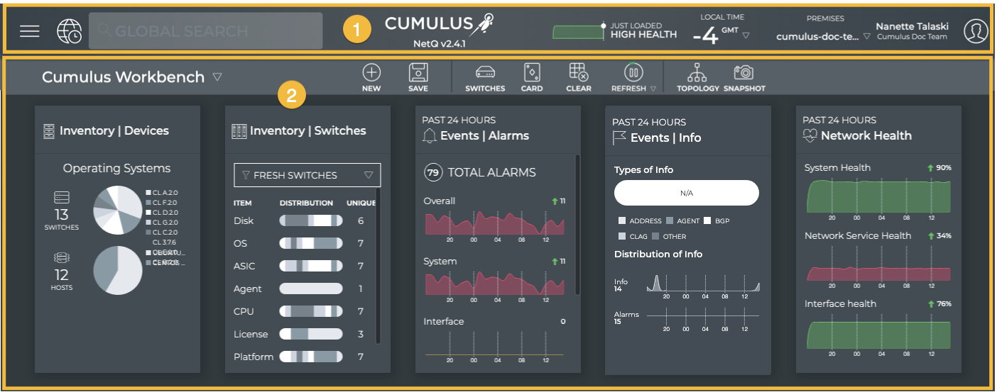
Application Layout
The NetQ UI contains two main areas:
- Application Header (1): Contains the main menu, recent actions history, search capabilities, NetQ version, quick health status chart, local time zone, premises list (cloud-only), and user account information.
- Workbench (2): Contains a task bar and content cards (with status and configuration information about your network and its various components).
Main Menu
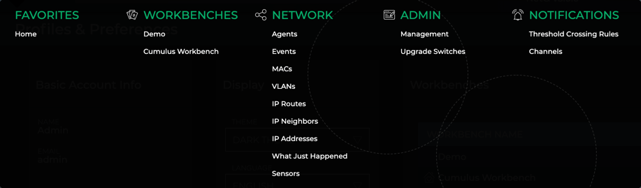
Found in the application header, click  to open the main menu which provides navigation to:
- Favorites: contains link to the user-defined favorite workbenches; Home is points to the Cumulus Workbench until reset by a user
- NetQ: contains links to all workbenches
- Network: contains links to tabular data about various network elements and the What Just Happened feature
- Admin: contains links to application management and lifecycle management features (only visible to users with Admin access role)
- Notifications: contains link to threshold-based event rules and notification channels
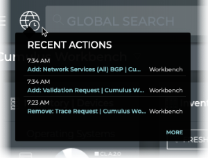
Recent Actions
Found in the header, Recent Actions keeps track of every action you take on your workbench and then saves each action with a timestamp. This enables you to go back to a previous state or repeat an action.
To open Recent Actions, click  . Click on any of the actions to perform that action again.
Search
The Global Search field in the UI header enables you to search for devices. It behaves like most searches and can help you quickly find device information. For more detail on creating and running searches, refer to Create and Run Searches.
Cumulus Networks Logo
Clicking on the Cumulus logo takes you to your favorite workbench. For details about specifying your favorite workbench, refer to Set User Preferences.
Quick Network Health View
Found in the header, the graph and performance rating provide a view into the health of your network at a glance.

On initial start up of the application, it may take up to an hour to reach an accurate health indication as some processes run every 30 minutes.
Workbenches
A workbench is comprised of a given set of cards. A pre-configured default workbench, Cumulus Workbench, is available to get you started. It contains Device Inventory, Switch Inventory, Alarm and Info Events, and Network Health cards. On initial login, this workbench is opened. You can create your own workbenches and add or remove cards to meet your particular needs. For more detail about managing your data using workbenches, refer to Focus Your Monitoring Using Workbenches.
Cards
Cards present information about your network for monitoring and troubleshooting. This is where you can expect to spend most of your time. Each card describes a particular aspect of the network. Cards are available in multiple sizes, from small to full screen. The level of the content on a card varies in accordance with the size of the card, with the highest level of information on the smallest card to the most detailed information on the full-screen view. Cards are collected onto a workbench where you see all of the data relevant to a task or set of tasks. You can add and remove cards from a workbench, move between cards and card sizes, and make copies of cards to show different levels of data at the same time. For details about working with cards, refer to Access Data with Cards.
User Settings
Each user can customize the NetQ application display, change their account password, and manage their workbenches. This is all performed from User Settings  > Profile & Preferences. For details, refer to Set User Preferences.
Embedded Application Help
The NetQ UI provides guided walk-throughs for selected tasks and links to additional resources.
You must have connection to the Internet to access this feature.
Click Need Help? to open the menu of tasks and resources currently available.
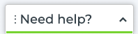
Is the help button covering content that you want to see? The button can be dragged and dropped to various locations around the edge of the UI, so if you do not like it on the bottom left (default), you can move it to the bottom center, bottom right, right side bottom, etc. A green dashed border appears in the locations where it can be placed. Alternately, enlarge the NetQ UI application window or scroll within the window to view any hidden content.
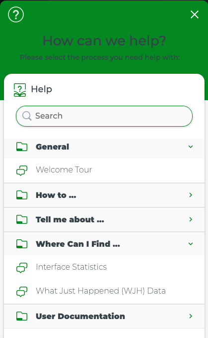
Within the help menu, topics are grouped by categories:
- General: These items describe or walk you through high-level tasks or information about the NetQ UI.
- How to…: These items walk you through how to perform common tasks.
- Tell me about…: These items describe features of the application.
- Where Can I Find…: These items help you find and use features that may be harder to find than others in the application.
- User Documentation: This provides a link to the Cumulus NetQ user documentation. It opens in a separate window so you can have it open while working in the application.
You can search for help items by collapsing and expanding categories or by searching. Click a category title to toggle between viewing and hiding the content. To search, begin entering text into the Search field to see suggested content.
Format Cues
Color is used to indicate links, options, and status within the UI.
| Item | Color |
|---|---|
| Hover on item | Blue |
| Clickable item | Black |
| Selected item | Green |
| Highlighted item | Blue |
| Link | Blue |
| Good/Successful results | Green |
| Result with critical severity event | Pink |
| Result with high severity event | Red |
| Result with medium severity event | Orange |
| Result with low severity event | Yellow |